Choose Your Hues
A guide to creating color palettes for your wedding florals and decor
Many couples are leaving the traditional “white wedding” behind, opting instead to use the color wheel to their advantage. A “bright wedding” can incorporate vibrant hues in small doses or as bold statements. Couples might select standout colors to match against an achromatic base, combine shades within the same color family or mix and match eye-catching hues.
The point is to have fun with it. Make note of colors you naturally gravitate toward or create a mood board for your wedding and see what shades you come up with. Planners, designers and florists can offer guidance and color-scheme expertise.
Your venue can help lead you to both your theme and your color palette, which can coincide. If your venue already leans heavily toward one color scheme, embrace it, or at least avoid colors that might clash.
Seasons can similarly inspire. Consider warm earth tones for fall, soft pastels for spring, bold and bright for summer and rich jewel tones for winter.
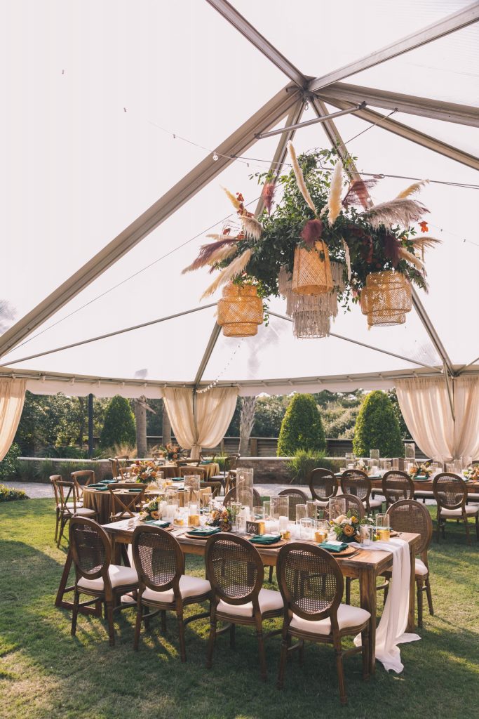
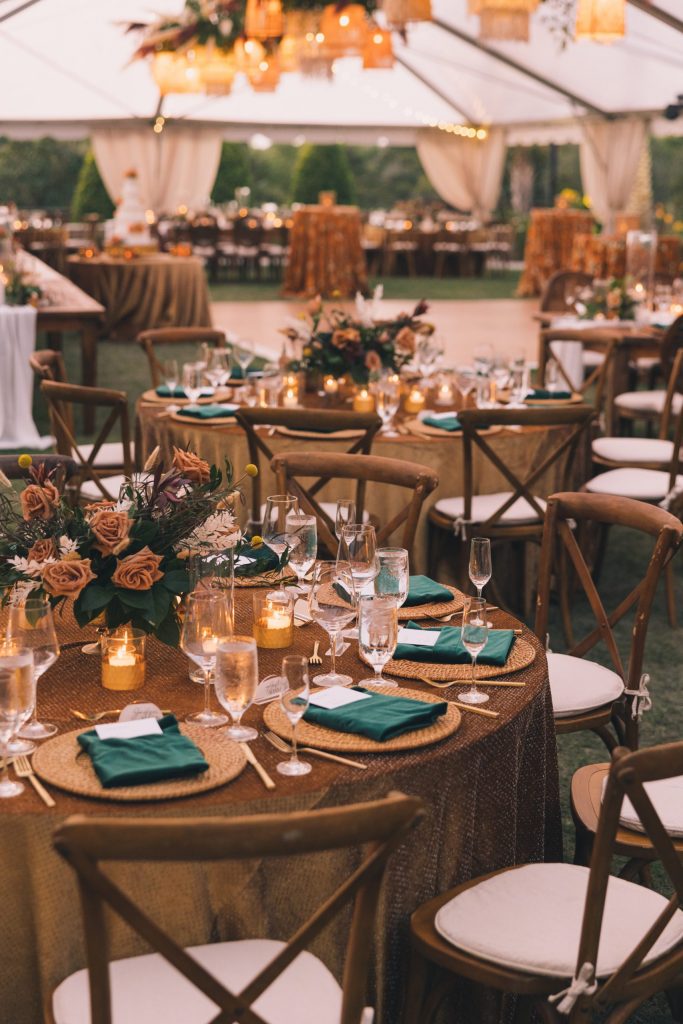
Aesthetic elements to be incorporated in the wedding day can influence color-palette choice, too — florals, table decor, bridal-party style and others. Begin by focusing on one element you know you want — pale pink peonies, lavender bridesmaids dresses or amber vases and dishware. Then choose complementing colors to form a cohesive palette.
“A lot of this process is based on the style of the wedding,” said Chelsea Finch, wedding specialist with A Country Rose Florals. “We discuss with the couple how much color is preferred, which helps us determine the floral base we use and then those secondary blooms to complement.”
Often, designers refer to a palette as a color story and advise five or fewer colors. Think of the story you want your colors to tell, beginning with a lead-character color and adding supporting characters from there.
“Color is magical because it can enhance an environment and create a vibe important to the couple,” said Ellie Gunnels, florist with Missy Gunnels Flowers. “Some couples have come up with a color palette for personal reasons, such as a place they vacationed the first time or a place they got engaged.”
Courtney Hicks, director of events at SunQuest Beach Weddings, has a recipe that serves her in guiding couples on color decisions. She begins by asking couples to provide inspiration pictures. She then inquires about any must haves, any dislikes and any floral allergies. This allows her to provide couples with three sample selections of curated florals.
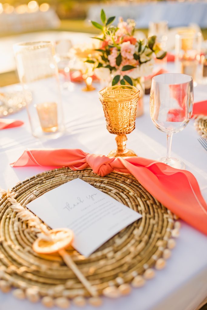
Other ways to infuse a hue include colored streamers, balloons, glass and tableware, invitation suites, tapestries, artwork, bridal-party wear, seating charts, linens, confetti and other decor elements.
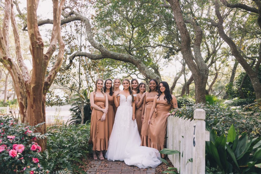
Finch noted that in 2022 earth-toned browns were very popular, and that trend is continuing, often paired with pops of fuchsia.
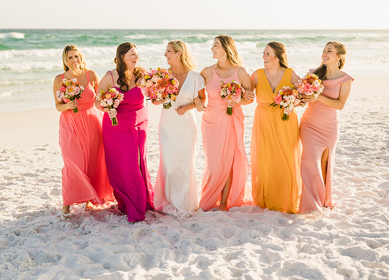
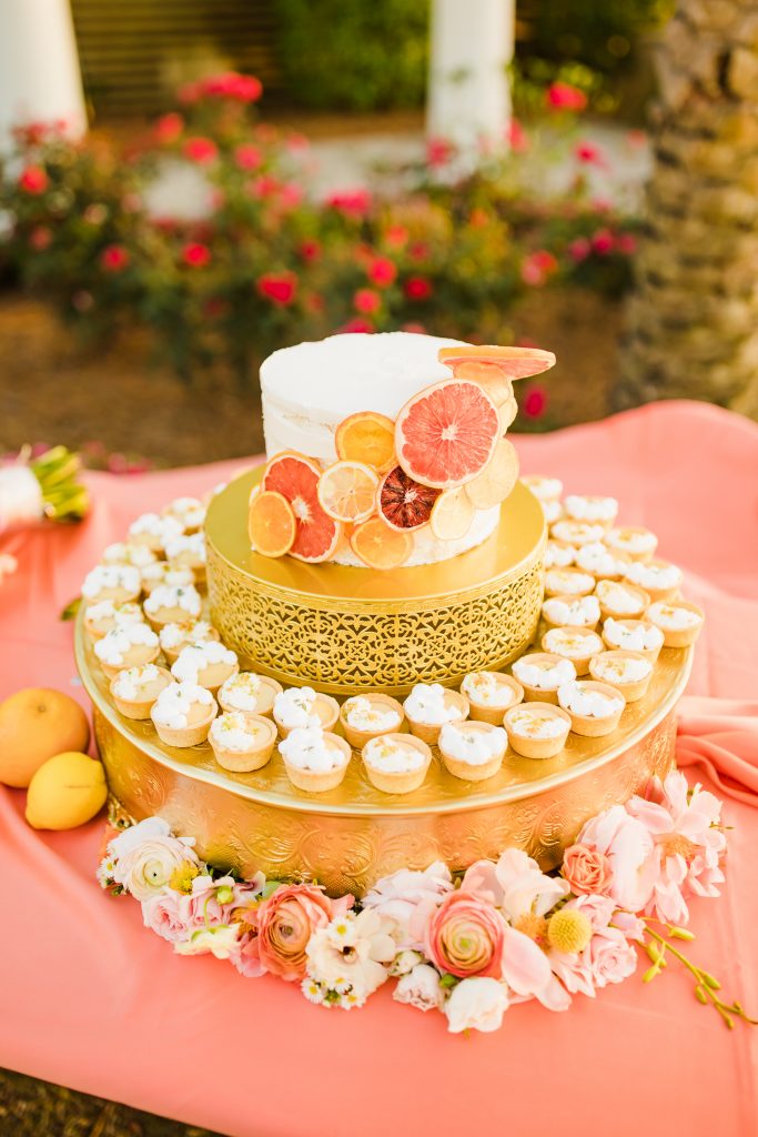
For 2023 and beyond, Gunnels adores the unexpected — bright pinks, orange shades and yellows paired with a pale purple or matching pastel corals, peaches and pinks with a bright red.
Hicks is drawn to mixing blues and pinks — navy blue and hot pink; dusty blue and blush pink; and glimmers of gold and bold pinks with burnt oranges and light blues.
Whichever hues you choose, be sure they speak to you as a couple — colors that elicit personal memories and will emphasize the individuality of your overall theme.
Feature photo courtesy of Jessica Winkler Photography
